Pantone colors are essential tools for designers and brand managers. But when it comes to plastic packaging—especially injection-molded bottles—Pantone rarely delivers an exact visual match. Here’s why.
Pantone colors are designed for ink on paper, not for pigmented plastic. The colorants used in injection molding behave differently from printing inks, and the base resin, surface finish, and processing conditions significantly affect the final appearance. This makes perfect Pantone-to-plastic color translation nearly impossible without tailored adjustments.
Color discrepancies between Pantone references and molded plastic are one of the most common sources of frustration in cosmetic packaging development. Let’s break down why this happens and what packaging professionals can do about it.
Contents
What Is Pantone, and Who Was It Designed For?
Pantone Matching System (PMS) was created in the 1960s as a standardized color language for graphic designers, printers, and brand teams. It allows stakeholders to communicate precise color expectations without relying on subjective terms like “sky blue” or “rose pink.”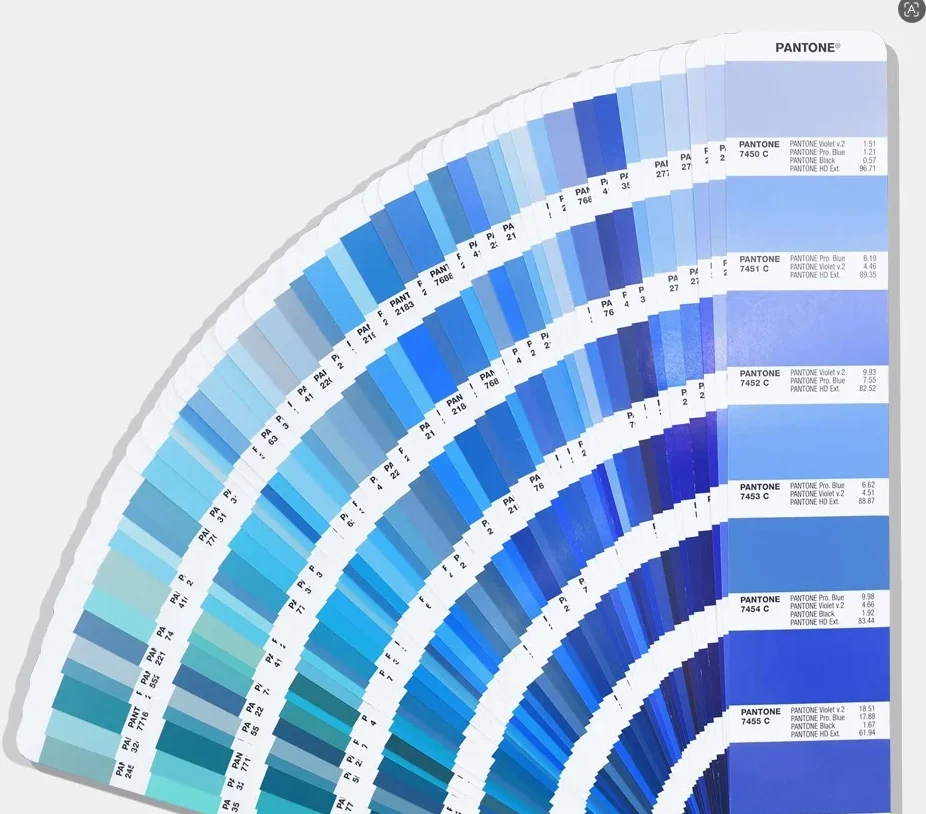
Key characteristics of Pantone:
- Based on ink printed on white paper, either coated (C) or uncoated (U)
- Developed under standardized lighting (typically D50 or D65)
- Controlled for ink film thickness, paper texture, and viewing angle
💡 Note: Pantone is perfect for print, packaging labels, and digital brand assets—but not for molded plastic parts.
Why Pantone Doesn’t Directly Apply to Plastics
Plastic coloring uses an entirely different physical process. While Pantone inks are printed on top of a white surface, plastic pigments are blended into molten resin before forming the final shape. The factors that affect the outcome are extensive.
Core Differences:
| Factor | Printing on Paper (Pantone) | Pigmented Plastic (Injection Molding) |
| Substrate | White, flat paper | Translucent or opaque polymer |
| Color application | Surface ink | Internal pigment dispersion |
| Color behavior | Reflective | Refractive and absorptive |
| Finish | Coated/uncoated | Glossy, matte, frosted, etc. |
| Opacity control | Ink density | Resin type and wall thickness |
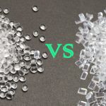
Injection Molding: Why Plastic Color Is So Variable
In injection molding, the base resin (e.g., PETG, PP, HDPE) is melted and combined with pigment. The resulting color depends not only on the pigment but also on:
- Processing temperature
- Cycle time
- Cooling speed
- Mold surface texture
- Wall thickness of the bottle
Even with the exact same pigment, the visual result can vary from batch to batch—especially across different production facilities or machines.
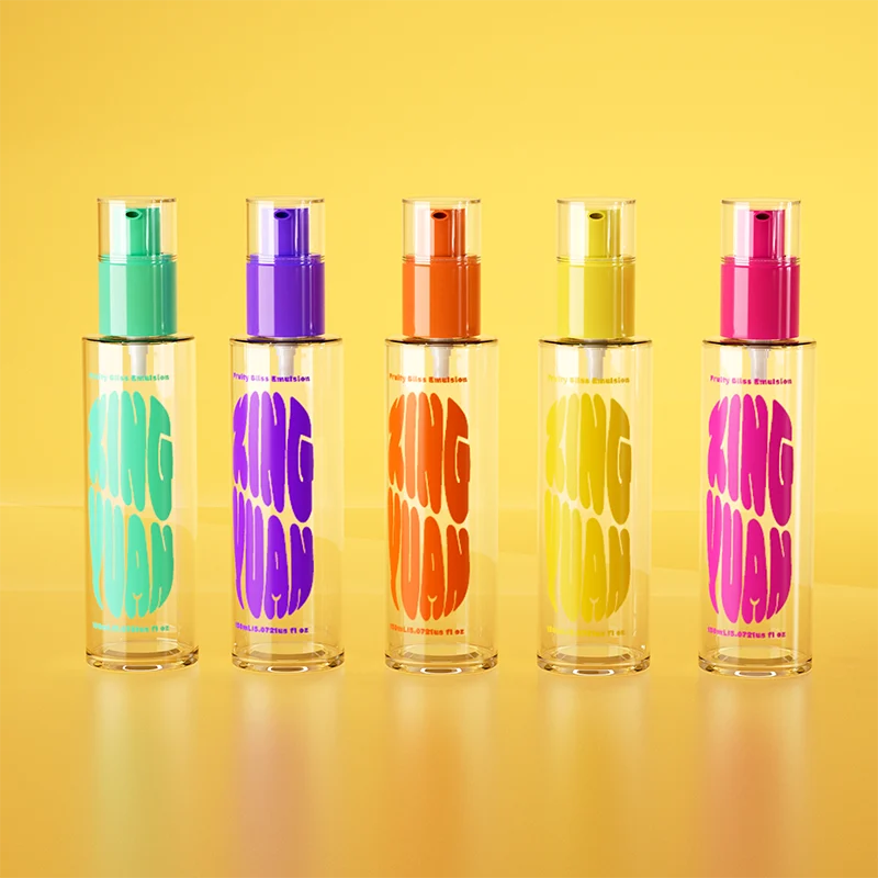
A Real Example: Pantone 488C on Paper vs PP vs PETG
Let’s consider Pantone 488C, a warm pink frequently used in skincare packaging.
| Substrate | Appearance |
| Pantone chip (coated paper) | Soft, blush-toned pink with slight gloss |
| PP (opaque) | Duller, slightly grayed tone |
| PETG (semi-transparent) | Brighter, more translucent pink |
| Frosted PETG | Softened, powdery pink with reduced brightness |
What you see is not what you get—unless you recreate the color match on the exact material and finish intended for final production.
How to Improve Pantone-to-Plastic Color Matching
Although perfect matches are rare, you can narrow the gap significantly by following these best practices:
1. Use Masterbatch Chips Instead of Paper Swatches
Request color samples created using the actual resin and colorant mix, molded in chip form. These chips reflect realistic color outcomes under production conditions.
2. Specify Resin Type and Finish Upfront
Colorant suppliers need to know the base polymer and intended surface finish before developing the formula. A color made for PETG won’t look the same on PP.
3. Evaluate Under Standard Lighting (D65)
Use the same light booth setup between your team and your supplier to eliminate inconsistent perception due to lighting differences.
4. Define Acceptable Color Tolerances
Set a clear ΔE threshold (e.g., ≤2.0) to define what level of color variation is acceptable. Remember: humans typically cannot perceive ΔE differences under 1.0.
5. Approve Samples from Actual Production Mold
Don’t sign off on flat plaques or alternate tooling. Approve the color on finished samples from the same mold and resin to be used in production.
Conclusion
Pantone is a universal color language—but it was never intended for pigmented plastic. Treating Pantone as a fixed benchmark in injection-molded packaging leads to unrealistic expectations, costly reworks, and project delays.
By understanding the physical and chemical differences between print and plastic, and by aligning all stakeholders on technical feasibility, brands can move from frustration to control in their color development process.
The next time you send a supplier a Pantone code, remember: it’s a reference, not a result.
Related Reads
- Why Is It So Difficult to Match Custom Colors for Cosmetic Packaging Bottles
- How Different Packaging Materials Impact Color Accuracy
- Lighting Conditions and Color Perception in Retail Environments
- How to Create a Color Approval Protocol (CAP) That Works
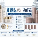
- Screen Printing vs. Full-Body Coloring What Works Best for Consistency