

Introduction
In the cosmetics industry, where packaging is as critical as the product itself, color plays a pivotal role in communicating brand identity, quality perception, and consumer appeal. Yet one of the most persistent complaints from beauty brands and procurement teams is that custom bottle colors rarely match the specified reference—despite clear instructions, Pantone codes, or even physical samples. Why does this happen, and what can be done to address it?
This article explores the technical, material, and perceptual challenges behind custom color matching in cosmetic bottle manufacturing, and offers actionable solutions for procurement managers and product development teams who demand precision and consistency.
Custom Color Matching Is Inherently Complex
Color inconsistency in cosmetic bottles is a result of three primary factors: limitations in pigment sampling and formulation, variations caused by resin properties and manufacturing conditions, and differences in lighting environments during approval versus end-use. Together, these create a system where visual outcomes become difficult to predict without a rigorous process.
1. Sampling vs. Production: Why Color Matching Rarely Begins on Solid Ground
Many brand owners believe that providing a Pantone code, a digital mock-up, or even a physical sample is sufficient to “lock in” a color for production. However, the initial inputs are rarely calibrated for plastic injection molding processes.
Pantone Is Designed for Print, Not Plastics
Pantone color codes are based on how inks appear on white-coated paper under standardized lighting. In contrast, bottle color is achieved through molten resin mixed with colorants or masterbatches—completely different in physical and chemical behavior. As a result, a Pantone 1767C might appear dramatically different when applied to PETG versus PP.
Production Variables Affect Outcome
Even with a well-formulated pigment blend, the following can cause deviation:
- Injection temperature
- Cooling speed
- Mold surface texture
- Pigment loading rate
- Cycle time and pressure
In small trial batches, these parameters may be tightly controlled. In mass production, slight drifts can result in ΔE values (color differences) that exceed acceptable tolerances.
Recommended Action:
Always use masterbatch samples made from the exact resin and molding conditions that will be used in production. Avoid approving colors based solely on Pantone paper chips or printed artwork.
2. The Role of Material and Finish in Perceived Color
Different polymers absorb and reflect light differently, even when infused with the same pigment.
| Material | Transparency | Surface Behavior | Color Outcome |
| PETG | High | Glossy | Brighter, more vibrant |
| PP | Medium | Slightly matte | More muted, possibly dull |
| HDPE | Low | Opaque, textured | Diffused, soft |
| Acrylic | High | Rigid, sharp | Enhanced saturation |
| Glass | Variable | Smooth, heavy | True color but affected by thickness |
The Finish Also Matters
Glossy surfaces reflect more ambient light, increasing the perceived brightness of the color. A frosted or matte finish diffuses light, making the same pigment appear darker and flatter.
Recommended Action:
Color approvals must be done on finished parts, with the intended surface finish applied. Avoid judging color from raw molded blanks.
3. Lighting Conditions and Metamerism: The Hidden Enemy
Even when color is matched correctly during lab trials, discrepancies arise in field use or store displays due to inconsistent lighting.
What Is Metamerism?
Metamerism occurs when colors appear identical under one light source but different under another. This is particularly problematic when:
- Approvals are done under lab lighting (D65)
- Retail lighting uses LEDs (3500–5000K)
- End-users view products under warm indoor lighting
For example, a pale nude tone may look pinkish under warm light, but grayish under cool LED light—despite being from the same batch.
Best Practices:
- Use D65 standard lighting booths for all color approvals
- Share light source specifications with your supplier
- Include environmental light simulation in final QC steps
4. Supply Chain Fragmentation and Communication Gaps
In many cases, color problems are not purely technical—they are organizational. When brand teams, molders, pigment suppliers, and packaging converters are not aligned, small misunderstandings can lead to production-scale issues.
Common Scenarios:
- The brand provides a sample in glass, but the production material is PP
- A supplier substitutes PETG with cheaper PET without adjusting the colorant
- A brand changes a finish (e.g., from gloss to matte) post color approval
In such cases, the color formula remains the same, but the appearance changes dramatically, leading to blame-shifting and urgent rework.
Recommendation:
Implement a Color Approval Protocol (CAP) that includes:
- Material identification
- Surface finish confirmation
- Light source standard
- Tolerance range (ΔE threshold)
- Sign-off procedure with both lab and buyer
5. What Buyers Can Do to Improve Color Matching Success
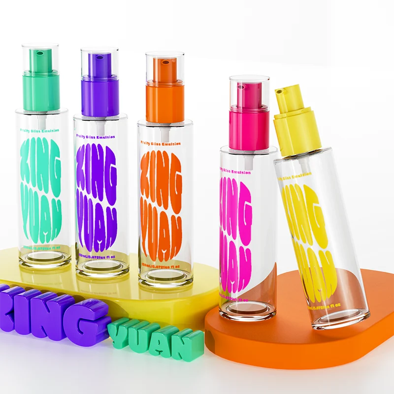 Procurement and packaging professionals can take the following steps to significantly reduce risk:
1. Start with Feasibility Assessment
Before selecting a Pantone or requesting a match, consult the supplier on whether the target color is viable on the chosen material and finish.
2. Request a Masterbatch Color Card
This is a resin chip created using the exact pigment and base resin combination. It’s more accurate than a Pantone reference or digital sample.
3. Use Standardized Evaluation Tools
Include a D65 light box, gray background, and neutral observation environment for all approvals. Mobile phone evaluations should be strictly avoided.
4. Establish Tolerance Standards
Agree with the supplier on an acceptable ΔE value (usually ≤2.0 for visual indistinguishability). Define how deviations will be managed—reject, rework, or accept with note.
5. Include On-Site Color Approval in SOP
Some leading brands send QC engineers or packaging specialists to the production site for on-the-spot adjustment during initial runs.
6. Supplier Capabilities That Influence Color Matching
Not all suppliers are equipped to meet high-precision color standards. When selecting a packaging partner, look for:
- In-house color lab with spectrophotometer
- Masterbatch production or access to custom pigment blends
- Capability for rapid small-batch trials
- On-site D65 booth and color inspection process
- Transparent sampling timeline and documentation
A low-cost supplier without these capabilities is more likely to cause delays, rejections, or brand damage down the line.
Summary
Color matching for cosmetic packaging bottles is not a one-step task—it’s an intricate process involving chemistry, physics, and human perception. The mismatch between expectations and outcomes often stems from differences in materials, light, technical parameters, and communication.
By treating color not as a static input but as a variable shaped by systems, beauty brands and procurement teams can design smarter processes, select better suppliers, and reduce costly production errors. The key lies in rigor, documentation, and close collaboration across the supply chain.
