Matching a color is not just about pigment—it’s about how that pigment interacts with the packaging material. If your product colors shift unexpectedly, your resin might be to blame.
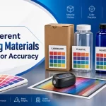
Packaging materials like PETG, PP, HDPE, acrylic, and glass each have unique optical properties that affect how color appears after production. Differences in transparency, surface gloss, pigment compatibility, and light absorption cause significant variation, even when using the same pigment formulation. Understanding material behavior is critical for accurate color reproduction in cosmetic packaging.
For beauty brands, precise color consistency across packaging lines is crucial for brand identity and consumer trust. But even the most carefully matched color formulation can look completely different depending on the material used.
Let’s examine how common cosmetic packaging materials alter color perception—and what procurement and product teams can do to manage these variations.
Contents
Why Does Packaging Material Affect Color?
When you inject a pigment into a molten polymer, the outcome is not simply “what the pigment looks like.” It’s the result of how light interacts with:
- The resin’s refractive index
- The material’s level of opacity or transparency
- The surface texture or gloss level
- The base color of the plastic
In short, materials either reflect, refract, or absorb light differently—and those optical characteristics alter the final perceived color.
How Major Packaging Materials Affect Color Appearance
Here’s how common materials used in cosmetic bottle production behave:
1. PETG (Polyethylene Terephthalate Glycol)
- Transparency: High
- Surface: Glossy, smooth
- Color Effect: Brightens pigments, increases vibrancy
- Common Uses: Skincare bottles, luxury serums, clear containers
PETG’s clarity enhances color brilliance. However, if the wall thickness varies, color may appear lighter or more saturated in some areas. Translucent colors work especially well in PETG.
2. PP (Polypropylene)
- Transparency: Low (semi-opaque)
- Surface: Slightly matte
- Color Effect: Dulls or mutes color, shifts tones toward gray
- Common Uses: Jars, caps, airless bottles
PP tends to “absorb” light, leading to a flatter and more muted appearance. A bright Pantone red may look brownish or faded when molded in PP unless adjusted for compensation.
3. HDPE (High-Density Polyethylene)
- Transparency: Opaque
- Surface: Textured or slightly rough
- Color Effect: Reduces saturation, softens sharp hues
- Common Uses: Tubes, squeezable bottles
HDPE’s opaque nature and low gloss make colors appear soft and chalky. It’s challenging to achieve sharp, metallic, or bright hues with HDPE.
4. Acrylic (PMMA)
- Transparency: High
- Surface: Rigid, high-gloss
- Color Effect: Enhances depth and sharpness of color
- Common Uses: Double-wall jars, caps, luxury containers
Acrylic replicates color very well—often closest to the original reference—due to its optical clarity and rigidity. However, it’s more brittle and expensive.
5. Glass
- Transparency: Variable (clear, frosted, tinted)
- Surface: Very smooth
- Color Effect: True color in clear glass; diffused color in frosted finishes
- Common Uses: High-end droppers, fragrance bottles
Glass preserves color tone well when clear but mutes and cools hues when frosted or thick-walled. Coatings on glass (e.g., spray finishes) add another variable.
The Interaction Between Material and Light: Three Key Mechanisms
1. Transparency and Light Penetration
Transparent materials (like PETG) allow light to pass through and reflect from internal surfaces, often creating brighter, more vivid colors.
Opaque materials (like PP and HDPE) absorb light, making the same color look darker or duller.
2. Surface Gloss and Reflection
Glossy surfaces reflect more light, emphasizing color intensity. Matte or textured surfaces scatter light, reducing saturation.
3. Thickness and Color Depth
The same pigment concentration will appear darker on thick-walled bottles than on thin-walled parts. Designers must account for structural design when specifying color.
Case Comparison: One Color, Five Materials
Let’s analyze how Pantone 233C (a vibrant pink) appears across five materials:
| Material | Outcome |
| PETG | Bright fuchsia, high vibrancy |
| PP | Muted mauve, slight gray tint |
| HDPE | Pale pink, chalky finish |
| Acrylic | Strong, saturated pink, near-perfect match |
| Glass (frosted) | Soft pastel pink, cooler temperature |
These variations are not due to formulation errors—they are optical consequences of material behavior.
How to Prevent Material-Based Color Surprises
✅ 1. Sample Using Final Material
Do not approve color from chips molded in substitute materials. Always request samples in the actual production resin and finish.
✅ 2. Adjust Formulation by Material
Pigment concentration and base color must be tweaked for each material. Don’t expect one formula to work across PETG and PP.
✅ 3. Standardize Wall Thickness
If your container design varies in wall thickness (e.g., shoulders vs base), color may appear inconsistent within the same part. Design for uniformity when possible.
✅ 4. Conduct Multi-Angle Color Evaluation
Because light behaves differently on curved or textured surfaces, view the sample from multiple angles under consistent lighting.
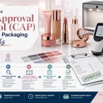
✅ 5. Include Material Type in Your Color Approval Protocol (CAP)
Color is not a formula alone—it’s a system. Material type must be documented in your approval records, with reference samples stored for revalidation.
Summary
Material selection plays a critical—but often overlooked—role in color fidelity for cosmetic packaging. Even when the same pigment is used, PETG, PP, HDPE, acrylic, and glass each bend light differently, resulting in visible color shifts. These aren’t mistakes; they’re physics.
To achieve consistent, on-brand color across SKUs and product lines, brands must treat material and color as a unified specification, not two separate tracks. Samples, approvals, and production must all be conducted using the same material under controlled conditions.
When done correctly, material-aware color matching transforms packaging from a liability into a brand asset.
Looking for premium packaging solution for your skincare products? Contact our team and share your packaging requirements. We will recommend the right solution for your brand.
Related Reads
- Why Is It So Difficult to Match Custom Colors for Cosmetic Packaging Bottles
- Pantone vs Plastic: Why They Never Truly Match
- Lighting Conditions and Color Perception in Retail Environments
- How to Create a Color Approval Protocol (CAP) That Works
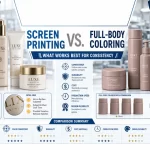
- Screen Printing vs. Full-Body Coloring What Works Best for Consistency