In cosmetic packaging, color consistency across product lines is critical. But should your brand rely on full-body molded color—or screen printing? The answer depends on your priorities.
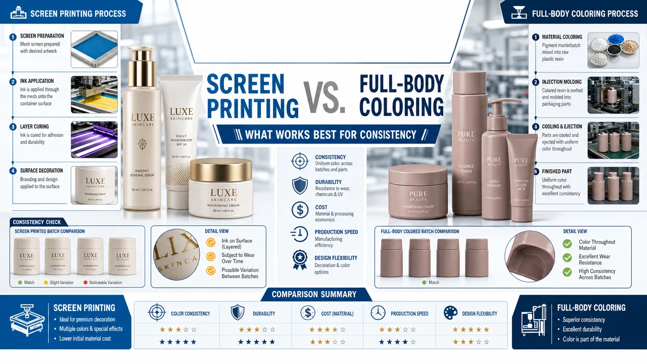
Full-body coloring integrates pigment into the plastic itself during injection molding, giving the entire bottle or jar its base color. Screen printing, in contrast, applies brand colors and visuals onto the surface post-production. While molded color offers a strong base tone, screen printing provides better control over color accuracy, especially across varying materials and formats.
Visual consistency is the backbone of successful beauty branding. A customer expects their 30ml serum, 100ml toner, and matching cream jar to align perfectly in color and style. But when those products come from different suppliers, molds, or materials, inconsistencies can creep in—even when using the same pigment formula.
The choice of coloring method—full-body coloring vs. screen printing—plays a central role in managing these risks.
What Is Full-Body Coloring?
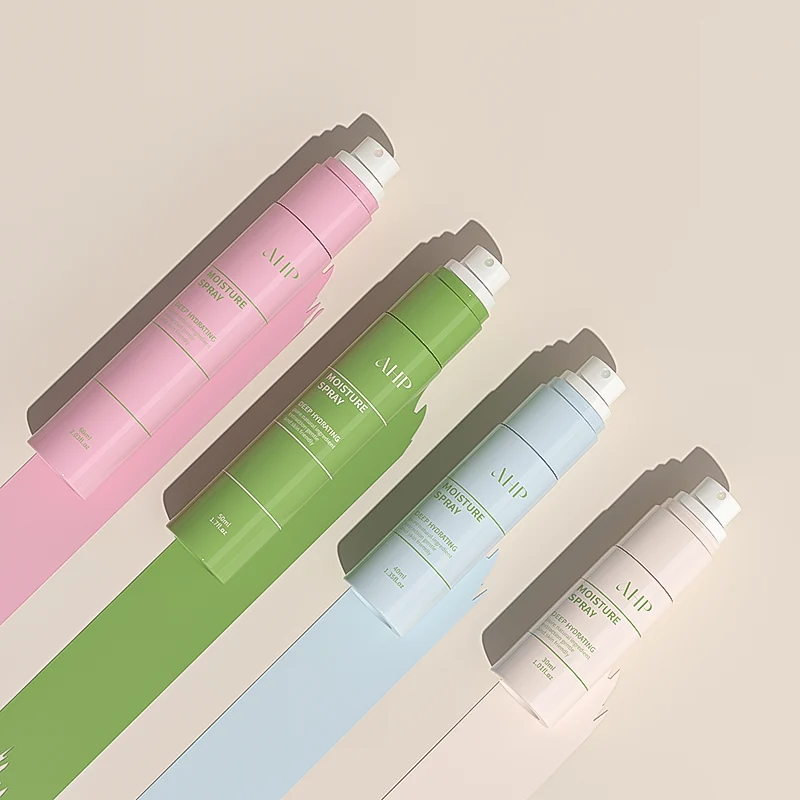
Full-body coloring involves mixing pigment (or masterbatch) into the raw resin before injection molding. The result is a package where the plastic itself is colored all the way through.
✔ Advantages:
- Uniform base tone across the entire bottle or jar
- No risk of label peeling or scratching
- Streamlined process—no extra post-processing required
- Lower cost per unit at high volumes
✘ Challenges:
- Color appearance is affected by material (PETG vs PP), finish (glossy vs matte), and wall thickness
- Once molded, the color is fixed—any mismatch requires complete re-production
- Hard to match exactly across suppliers or batches
- Difficult to reproduce precise brand colors (e.g. Pantone)
Use case: Single-material, mass-produced SKUs where base color matters more than branding precision.
What Is Screen Printing?
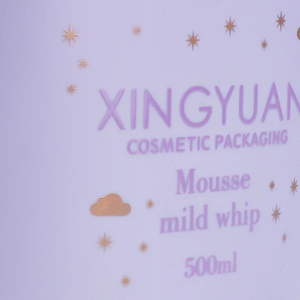
Screen printing involves applying ink (usually UV-cured) directly onto the surface of bottles, jars, or tubes. It’s a post-molding process that allows for fine control over text, logos, and color areas.
✔ Advantages:
- Excellent color precision—easier to match Pantone shades
- Brand visuals (logos, icons, gradients) can be reproduced accurately
- No dependency on resin properties or mold shape
- Works across varied shapes, materials, and batch sizes
✘ Challenges:
- Not suitable for covering large surfaces evenly
- Potential for wear or abrasion over time
- Higher unit cost (especially for multi-color or small batch runs)
- Requires tooling and alignment setup for each SKU
Use case: Branding-critical areas such as logos, product names, dosage indicators, or luxury finishes.
Technical Comparison: Molded Color vs. Screen Print
| Factor | Full-Body Coloring | Screen Printing |
| Color Consistency | Medium (material-dependent) | High (surface-only) |
| Pantone Accuracy | Low | High |
| Durability | Excellent | Good (can be scratched) |
| Cost (large volumes) | Low | Moderate to high |
| Production Speed | Faster | Slower (post-processing) |
| Design Flexibility | Limited | High (multi-color, branding) |
| Material Sensitivity | High | Low |
| MOQ Flexibility | Better for large runs | Better for small batches or variants |
When to Use Full-Body Coloring
- Your product is molded in a single material and color is part of the structure
- Visual consistency is less critical than cost-efficiency
- You’re producing at high volume (e.g., 50,000+ units per SKU)
- Color variation of ±ΔE 2.0 is acceptable
- No intricate branding or multi-color visuals are required
Example: A matte-black PP airless bottle for a minimalist skincare line.
When to Use Screen Printing
- You need high-fidelity branding with accurate Pantone matching
- SKUs use different base materials (e.g., PP jar + PETG bottle + glass dropper)
- Your product line includes seasonal or limited editions
- Your brand uses gradients, metallic inks, or custom visuals
- You require modular packaging formats but still want unified branding
Example: A rose-gold logo printed on frosted PETG and glossy acrylic across 5 SKUs.
Hybrid Strategy: Combining Both for Brand Control
Many premium brands use a hybrid approach:
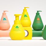
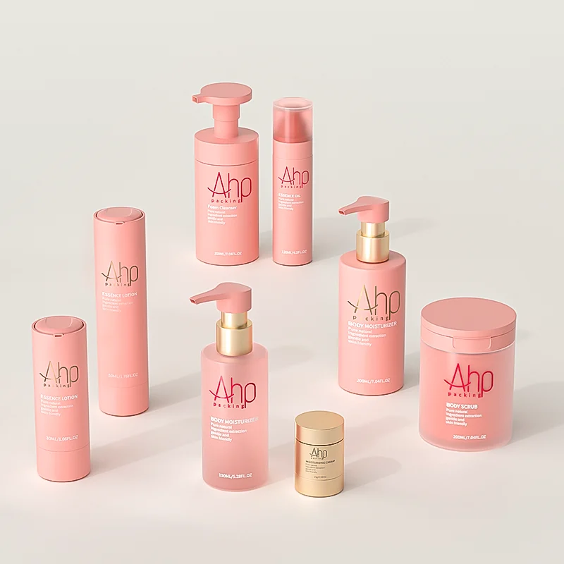
- Use full-body coloring to create a unified base tone (e.g., soft pastel pink)
- Apply screen printing to overlay brand visuals, texts, and accent colors
- Choose neutral molded tones (white, beige, translucent) and customize via print
- This method improves production flexibility while ensuring brand consistency
For example, a brand may:
- Mold all jars in natural PP
- Print different product lines in unique accent colors
- Maintain the same logo and typeface across packaging
Additional Considerations
1. Packaging Lifecycle
Screen printing may wear off with repeated use (e.g., lotion pumps, tubes). If longevity is critical, consider:
- Hot stamping for metallic effects
- In-mold labeling (IML) for permanent visuals
- Laser engraving for glass or rigid acrylic
2. Supplier Capabilities
Not all suppliers offer screen printing in-house. For complex branding, ensure your partner has:
- Multi-color print capability
- Pantone ink matching
- Surface treatment options (corona, UV coating)
3. Environmental Considerations
Screen printing adds to production complexity and may limit recyclability if inks or coatings interfere with sorting. Molded-in color is typically more recyclable, especially in mono-material formats.
Summary
There’s no universal best choice between full-body coloring and screen printing—it depends on your priorities.
- Choose full-body coloring when structural uniformity, high volume, and cost control matter most.
- Choose screen printing when precise brand expression, color fidelity, and SKU flexibility are key.
- Or, combine both for a scalable, brand-consistent solution across materials and markets.
In packaging, color is more than pigment—it’s perception, process, and positioning. Choose your methods accordingly.
Related Articles
- Why Is It So Difficult to Match Custom Colors for Cosmetic Packaging Bottles
- Pantone vs Plastic: Why They Never Truly Match
- How Different Packaging Materials Impact Color Accuracy
- Lighting Conditions and Color Perception in Retail Environments
- How to Create a Color Approval Protocol (CAP) That Works