For decades, the cosmetic industry has relied on color-coded marketing — pink for her, black for him. But today’s consumers are redefining beauty. Outdated gender packaging can feel limiting. To win hearts across audiences, brands must understand gender’s design psychology — and evolve toward inclusive, thoughtful, and universally appealing packaging.
Gender influences cosmetic packaging through color, shape, texture, and typography. Men’s packaging often uses dark colors, angular forms, and minimalist design to express strength and simplicity. Women’s packaging tends to feature curves, soft tones, and elegant finishes that evoke care and luxury. However, gender-neutral packaging — defined by clean design and balanced palettes — is now rising as modern consumers value inclusivity and authenticity over stereotypes.
Let’s dive into the psychology, form, and function of gender-based design — and how the shift toward inclusivity is transforming the future of cosmetic packaging.
Contents
- 1. The Psychology of Gender in Packaging Design
- 2. Color Codes: How Hues Define Perception
- 3. Shapes and Textures: Masculine vs Feminine Appeal
- 4. Typography and Graphics: Communicating Identity
- 5. Breaking the Binary: Rise of Gender-Neutral Packaging
- 6. Cultural and Regional Perspectives on Gendered Design
- 7. Case Studies: Brands Redefining Gender in Beauty
- 8. How Our Factory Helps Brands Design for Everyone
- Summary
1. The Psychology of Gender in Packaging Design
Packaging doesn’t just protect a product — it communicates identity. Gender cues in color, shape, and texture influence consumer perception long before they open the lid.
Historically, marketers used visual shortcuts: dark, matte tones for masculine strength; pastel shades and curves for feminine softness. These cues worked well in traditional retail environments, where visual contrast helped customers quickly identify gendered products.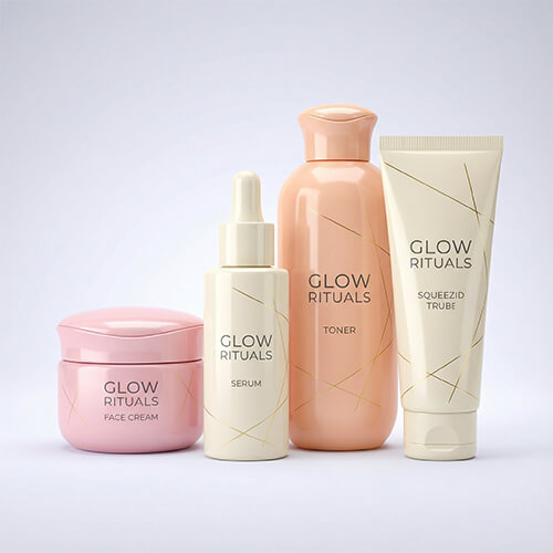
However, as social awareness evolves, consumers increasingly reject rigid labels. Millennials and Gen Z buyers — especially in the beauty space — see gender as fluid, expressive, and personal.
This means packaging design must shift focus: from defining who the consumer “should” be to reflecting who they truly are.
Our factory helps brands design packaging that balances psychological appeal with modern inclusivity, blending emotion with neutrality to reach every audience segment authentically.
2. Color Codes: How Hues Define Perception
Color remains the most immediate and powerful communicator of gender in packaging.
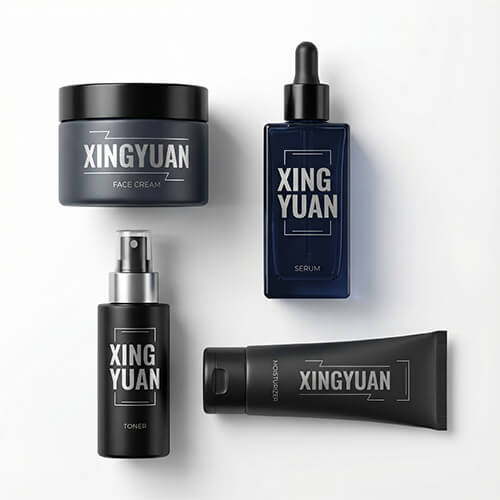
🖤 Masculine Palettes
Men’s cosmetic packaging traditionally uses:
- Black, gray, and navy — to convey strength, reliability, and minimalism.
- Metallic finishes — symbolizing modernity and technology.
- Bold contrasts — clean, no-nonsense visuals.
These tones appeal to consumers seeking straightforward, “functional” beauty — typical of men’s grooming or skincare lines.
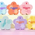
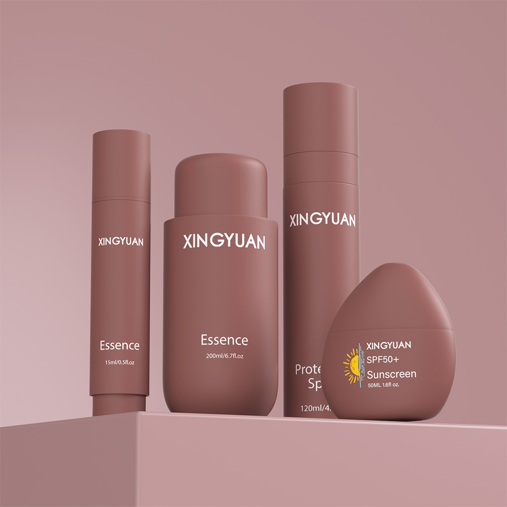
💗 Feminine Palettes
Women’s products, on the other hand, often favor:
- Soft pastels (blush pink, lavender, ivory) to evoke gentleness.
- Gold and rose accents to suggest luxury and indulgence.
- Gradient effects that feel elegant and romantic.
The goal is to create warmth, intimacy, and self-care — not just utility.
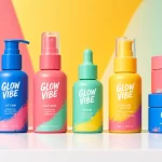
🌈 The Rise of Gender-Neutral Color Psychology
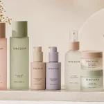
In contrast, gender-neutral packaging uses balanced, natural tones — beige, sage green, off-white, and muted blues — reflecting harmony and inclusivity.
Think Aesop’s amber bottles, The Ordinary’s clinical neutrals, or Fenty Skin’s lilac tones. These hues transcend gender and focus on authenticity, transparency, and sustainability — values modern consumers care about most.
Our factory uses precise color-matching systems to help brands build recognizable, inclusive palettes that look premium on any shelf.
3. Shapes and Textures: Masculine vs Feminine Appeal
Packaging shape and tactile experience also communicate gender identity.
🔺 Masculine Design Cues
Men’s packaging is often:
- Angular, sturdy, and compact, signaling confidence and control.
- Textured or matte, suggesting durability and utility.
- Straight-edged or geometric, with clean symmetry.
The packaging “feels” technical, evoking performance and strength — especially in shaving, hair, and skincare products.
🔵 Feminine Design Cues
In contrast, women’s packaging usually embodies:
- Curves and rounded shapes — symbolizing softness and fluidity.
- Smooth or glossy finishes, enhancing the sense of touch.
- Delicate proportions, designed for aesthetic display.
It’s an emotional connection through touch — packaging that “feels beautiful.”
⚪ The Inclusive Middle Ground
Modern beauty brands now aim for balanced form:
- Soft rectangles, minimalist curves, and matte textures that work for all genders.
- Tactile finishes (like soft-touch coatings) that convey quality rather than gender bias.
At our factory, we use ergonomic mold design to create packaging that fits comfortably in any hand — sleek, balanced, and universally appealing.
4. Typography and Graphics: Communicating Identity
Typography is the silent storyteller of brand identity.
Masculine Typography
- Bold sans-serif fonts convey clarity and authority.
- Straight lines and all-caps layouts suggest precision and discipline.
- Minimal color contrast keeps messaging direct and technical.
Feminine Typography
- Serif or script fonts evoke sophistication and emotion.
- Thin lines and flowing curves communicate elegance and approachability.
- Gold foiling or embossing adds a touch of refinement.
![]()
Gender-Neutral Typography
Neutral branding opts for simple, legible fonts and clean spacing — modern without being cold. Fonts like Helvetica Neue or Avenir create inclusivity through simplicity.
Our in-house designers integrate typographic balance into every concept — aligning aesthetic tone with the brand’s message, whether masculine, feminine, or unisex.
5. Breaking the Binary: Rise of Gender-Neutral Packaging
One of the most exciting shifts in cosmetic branding today is the decline of gender binary packaging.
Inclusive brands understand that beauty isn’t defined by gender — it’s about self-expression and care.
🌿 Examples of this evolution include:
- Fenty Skin: Soft lavender tones and rounded packaging appeal to all users.
- The Ordinary: Clinical minimalism and transparent labeling feel universal.
- Byredo: Monochrome, fragrance-based design breaks every gender rule.
Why Gender-Neutral Packaging Works
- Reflects modern values — equality, individuality, authenticity.
- Expands the market — appealing to both men and women without segmentation.
- Simplifies production — one unified design line reduces tooling and material costs.
Our factory specializes in modular mold systems that allow brands to customize surface textures or finishes for gender-neutral lines — achieving inclusivity without additional production costs.
6. Cultural and Regional Perspectives on Gendered Design
Gender cues in packaging also vary globally, influenced by cultural norms and aesthetic traditions.
In Western Markets
Masculine minimalism and feminine luxury remain dominant, but unisex aesthetics — led by brands like Glossier and Malin+Goetz — are redefining mainstream appeal.
In Asian Markets
Femininity often equates to purity and refinement, reflected in soft tones and elegant forms. Male grooming brands, however, embrace technological sophistication with metallic or futuristic designs.
In the Middle East
Luxury and ornamentation carry cultural weight. Golds, rich blues, and arabesque patterns blend strength with beauty across gender lines.
By studying these preferences, our design team helps global brands localize packaging — aligning gender expression with cultural storytelling while maintaining brand coherence.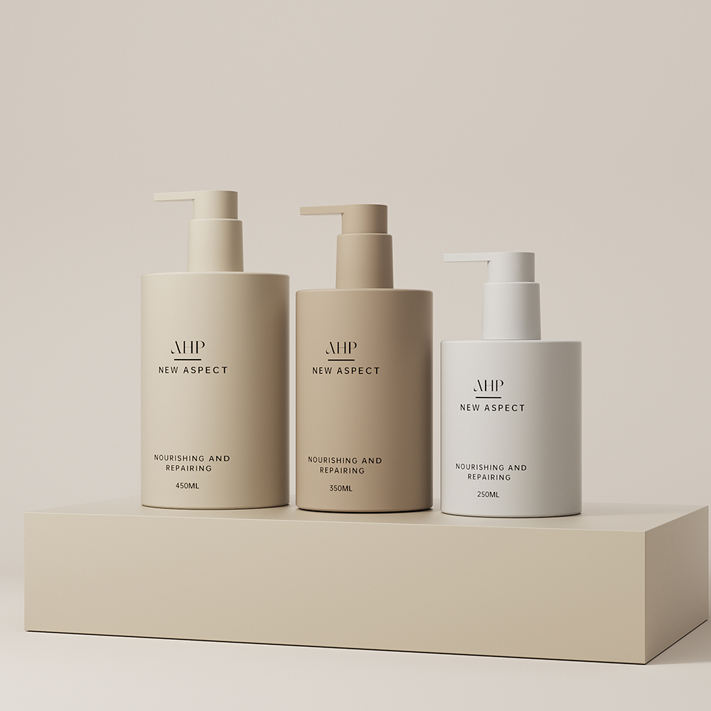
7. Case Studies: Brands Redefining Gender in Beauty
Fenty Skin
Rihanna’s brand challenged gender norms with lavender-gray packaging that feels inclusive and chic. Its rounded bottles and refillable systems resonate with all identities.
Aesop
Known for amber glass and minimal typography, Aesop’s design eliminates gender cues entirely, focusing instead on honesty and material integrity.
Tom Ford Beauty
Though luxurious, Tom Ford bridges gender with black-and-gold elegance — powerful, timeless, and universal.
Humanrace by Pharrell Williams
The brand uses vivid green biodegradable packaging and refillable bottles — a bold yet neutral aesthetic celebrating individuality beyond gender.
Each of these brands proves that inclusivity and sophistication can coexist — gender-free doesn’t mean design-free.
8. How Our Factory Helps Brands Design for Everyone
Creating gender-conscious packaging requires more than trend awareness — it demands strategic empathy.
At our factory, we partner with cosmetic brands worldwide to design packaging that communicates identity, inclusivity, and innovation.
💡 Our Capabilities Include:
- Custom mold design for both gendered and unisex lines.
- Advanced color calibration to achieve inclusive, balanced palettes.
- Textural engineering — matte, glossy, or hybrid finishes for emotional appeal.
- Typography and graphics consulting for global markets.
- Eco-friendly materials and refillable packaging to align with modern values.
- A five-member design team experienced in gender-sensitive brand storytelling.
We help brands merge aesthetic psychology with manufacturing precision — delivering packaging that resonates with real people, not stereotypes.
Whether you’re designing a men’s grooming series, a feminine skincare line, or a gender-neutral brand, our one-stop service ensures every detail reflects care, quality, and creativity.
Summary
Gender influences how packaging communicates — through color, form, and feel. But the future of beauty is inclusive. Our factory helps brands craft designs that speak to individuality, not stereotypes — balancing emotion, elegance, and equality in every detail. Because great packaging belongs to everyone.