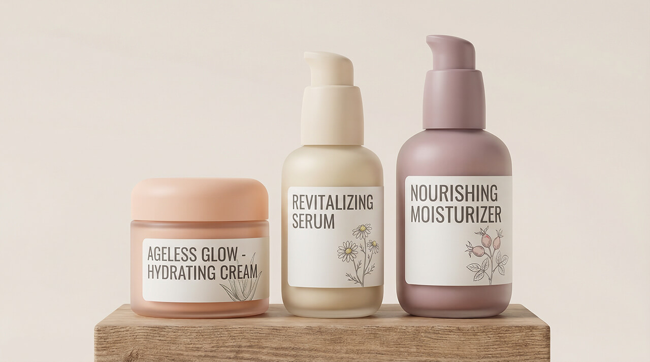
As the beauty world races toward innovation, older consumers are too often left behind. Small fonts, tight caps, and flashy packaging create unnecessary barriers. Seniors deserve designs that honor their experience — packaging that feels gentle, easy to handle, and thoughtfully crafted to bring comfort and confidence back into beauty.
Cosmetic packaging for seniors emphasizes accessibility, comfort, and clarity. Ergonomic shapes, easy-open caps, and large-font labeling improve usability. Soft textures and pastel colors evoke trust and warmth. Safe, hygienic dispensers — like pumps or airless jars — ensure ease of use and product integrity. Gentle, inclusive design turns beauty care into a pleasant daily ritual for older consumers.
Let’s discover how empathy-driven design, ergonomic innovation, and soft aesthetics can transform everyday cosmetic packaging into a tool of care and independence for senior beauty lovers.
Contents
- 1. Understanding Senior Beauty Consumers: Comfort and Confidence
- 2. Accessibility First: Ergonomic Design and Usability
- 3. Clarity and Readability: The Importance of Legible Design
- 4. Soft Aesthetics: Colors, Materials, and Emotional Warmth
- 5. Safe and Hygienic Dispensers: Function with Care
- 6. Balancing Simplicity and Sophistication
- 7. Case Studies: Brands Leading the Way in Senior-Friendly Packaging
- 8. How Our Factory Designs Packaging that Cares
- Summary
1. Understanding Senior Beauty Consumers: Comfort and Confidence
Seniors — typically aged 60 and above — represent a rapidly growing demographic in the global beauty market. This group values comfort, reliability, and simplicity over novelty.
They’re not chasing trends; they’re seeking products that feel trustworthy and easy to use. Beauty, for them, is an act of self-respect — not vanity.
Yet, many cosmetic packages remain poorly suited to their physical needs: slippery jars, unreadable labels, and stiff pumps often make beauty routines frustrating.
To connect with senior consumers, packaging must blend functionality with emotion — evoking warmth, clarity, and dignity. It’s not just about accessibility; it’s about designing with empathy.
At our factory, we approach senior packaging design with a clear goal: to restore joy and independence to everyday beauty rituals.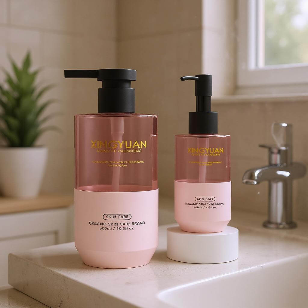
2. Accessibility First: Ergonomic Design and Usability
The foundation of senior-friendly packaging is accessibility — making every motion effortless and intuitive.
♻️ Key ergonomic features that matter:
- Easy-open caps and wide grips reduce strain on hands and wrists.
- Squeezable tubes require less pressure than twist caps or droppers.
- Lightweight containers prevent fatigue while maintaining a premium feel.
- Stable, non-slip bases provide steadiness on countertops.
For older adults with arthritis or reduced dexterity, these small details make a world of difference.
Our engineers use 3D ergonomic modeling to test grip, torque, and usability during prototype stages. We even simulate hand angles and pressure points — ensuring that every design feels natural, not challenging.
Accessibility doesn’t mean compromising style. It means designing intelligence into simplicity, where form naturally supports function.
3. Clarity and Readability: The Importance of Legible Design
As vision declines with age, readability becomes a crucial factor in packaging design.
Small fonts, low-contrast colors, or reflective surfaces make it difficult for seniors to read essential information like ingredients, directions, or expiration dates.
👁️ To ensure clarity:
- Use large, bold fonts with high contrast (e.g., dark text on light backgrounds).
- Avoid excessive text or decorative fonts that clutter the layout.
- Include tactile markers or raised labels for easy identification.
- Simplify copywriting — short, direct messaging communicates trust.
Clarity communicates care. Seniors appreciate when brands respect their visual comfort and make them feel considered, not overlooked.
Our factory offers custom font scaling and surface printing techniques — such as matte finishes to prevent glare and laser marking for sharp readability — ensuring packaging remains clear and legible under any lighting condition.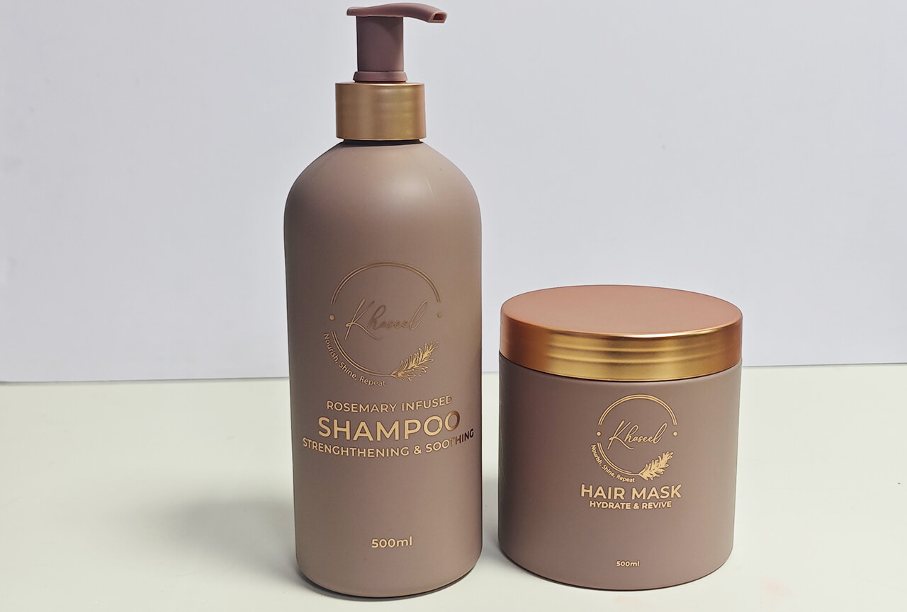
4. Soft Aesthetics: Colors, Materials, and Emotional Warmth
For senior consumers, beauty should feel gentle and reassuring. The aesthetic experience of packaging — its color, touch, and tone — plays a big role in emotional connection.
🌸 Color Psychology
Soft, muted tones like ivory, blush pink, sage green, and pearl gray evoke calmness and trust.
Avoid overly vibrant or metallic shades that can appear harsh or tiring to the eyes.✋ Material & Texture
- Matte finishes and soft-touch coatings feel secure and pleasant to hold.
- Velvety plastics and frosted glass communicate warmth and luxury.
- Curved silhouettes suggest friendliness and approachability.
The tactile aspect of packaging becomes especially meaningful with age — it’s not just visual pleasure, but emotional comfort through touch.
Our design team focuses on blending gentle aesthetics with high functionality, ensuring every package feels caring both in form and feeling.
5. Safe and Hygienic Dispensers: Function with Care
Hygiene and safety are top priorities for seniors who may have sensitive skin or health concerns. Packaging must prevent contamination while remaining effortless to use.
🧴 Senior-friendly dispensing solutions include:
- Airless pump bottles: Minimize oxidation and bacteria exposure.
- Single-hand applicators: Provide convenience for reduced mobility.
- Flip-top caps: Easier to open than screw lids.
- Refillable airless jars: Combine eco-friendliness with practicality.
We often recommend pumps over droppers or open jars for senior skincare products, ensuring both hygiene and ease.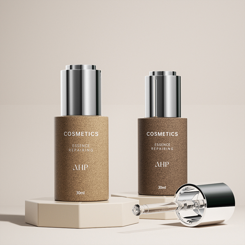
Our factory develops low-resistance pump systems that deliver smooth, precise dosage — designed for gentle touch and long-term reliability.
6. Balancing Simplicity and Sophistication
Simplicity doesn’t mean plain. Seniors, especially those who’ve spent decades using beauty products, appreciate sophistication — but in measured, meaningful ways.
Elegant minimalism, not excess, defines successful packaging for this demographic.
💎 Design principles for subtle elegance:
- Neutral colors paired with gold or silver accents communicate timeless luxury.
- Readable, balanced layouts convey order and peace.
- Subtle embossing or foil stamping adds class without clutter.
Our philosophy: Design that comforts the hand and delights the eye.
It’s about creating packaging that feels premium but never intimidating — a quiet confidence that appeals to seniors’ lifelong appreciation for quality.
7. Case Studies: Brands Leading the Way in Senior-Friendly Packaging
Olay Regenerist
Olay’s jars and pumps feature wide lids and sturdy bases, designed for easy grip. The use of red and silver tones conveys both energy and refinement — perfect for mature consumers.
L’Oréal Age Perfect
This line uses airless pumps and clear labeling, blending elegance with ease of use. The packaging feels premium but approachable.
Shiseido Vital-Perfection
Shiseido’s senior skincare range combines ergonomic bottle curves with soft gold tones. Every touchpoint feels intentional, expressing care and cultural respect for aging gracefully.
No7 Restore & Renew
This brand’s clean typography and gentle pink packaging make skincare feel soothing, not clinical — striking the perfect balance between usability and beauty.
Each of these brands demonstrates that senior packaging can be both functional and emotionally resonant — proof that caring design creates lasting brand loyalty.
8. How Our Factory Designs Packaging that Cares
Creating senior-friendly packaging requires more than technical precision — it requires empathy, insight, and a genuine desire to improve lives.
At our factory, we design packaging that combines ergonomic comfort, gentle aesthetics, and trustworthy craftsmanship.
💡 Our Expertise Includes:
- Custom ergonomic molds for comfortable grip and easy opening.
- Readable surface printing using high-contrast inks and large fonts.
- Airless pump systems and flip-top designs for hygienic convenience.
- Soft-touch surface treatments that add security and warmth.
- Eco-friendly materials like PCR plastics and lightweight glass.
- Collaborative design service through our five-member creative team, specializing in senior and healthcare packaging design.
We see senior packaging not just as a technical project, but as a mission of dignity — helping every user feel confident and cared for.
With decades of manufacturing experience and a one-stop service model — from design sketches to mass production — we help beauty brands transform compassion into craftsmanship.
Summary
For seniors, cosmetic packaging should be as caring as the product inside — gentle, accessible, and thoughtfully made. By combining ergonomic design, soft aesthetics, and safety innovation, our factory helps brands create packaging that empowers independence, builds trust, and turns everyday beauty into a moment of kindness.
